Element Styles
Overview
alias of |
|
|
The appearance of a button. |
|
The appearance of a checkbox for some state. |
|
The appearance of a checkbox. |
alias of |
|
|
The appearance of a container. |
alias of |
|
|
The appearance of a pane_grid. |
|
The appearance of a pick list menu. |
|
The appearance of a pick list for some state. |
|
The appearance of a pick list. |
alias of |
|
|
The appearance of a progress_bar. |
|
The appearance of a radio button for some state. |
|
The appearance of a radio. |
alias of |
|
|
The appearance of a rule. |
|
The appearance of a |
|
The appearance a specific state of a |
|
The appearance of the scroller of a |
|
The appearance of a slider for some state. |
|
The appearance of a slider. |
|
The appearance of a |
|
The appearance of a |
Quick Example
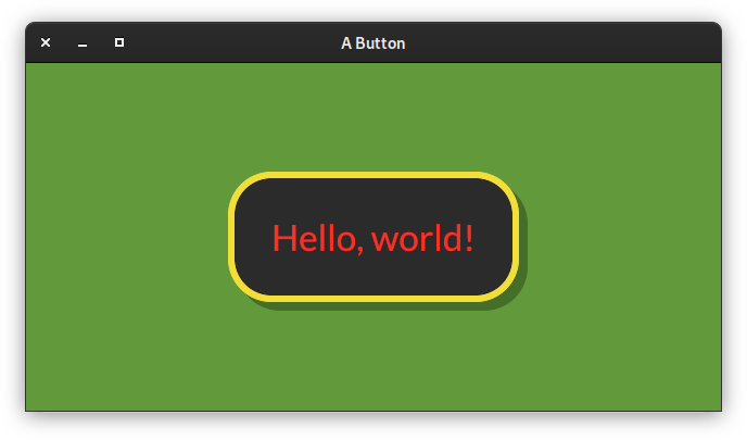
from pyiced import (
    Align, button, ButtonState, ButtonStyle, Color, container,
    ContainerStyle, IcedApp, Length, text,
)


class ButtonExample(IcedApp):
    class settings:
        class window:
            size = (640, 320)

    def __init__(self):
        self.__button_state = ButtonState()

    def title(self):
        return 'A Button'

    def view(self):
        styled_button = button(
            self.__button_state,
            text('Hello, world!', size=40),
            '',
            style=ButtonStyle(
                shadow_offset=(8, 8), border_radius=40, border_width=6,
                background=Color(0.17, 0.17, 0.17),
                border_color=Color(0.95, 0.87, 0.22),
                text_color=Color(1.00, 0.18, 0.13)
            ),
            padding=40,
        )
        return container(
            styled_button,
            style=ContainerStyle(background=Color(0.38, 0.60, 0.23)),
            padding=20, align_x=Align.CENTER, align_y=Align.CENTER,
            width=Length.FILL, height=Length.FILL,
        )


if __name__ == '__main__':
    ButtonExample().run()
Details
- pyiced.ButtonStyle
alias of
pyiced.ButtonStyleSheet
- class pyiced.ButtonStyleSheet(proto=None, **kwargs)
The appearance of a button.
- Parameters
proto (Optional[ButtonStyleSheet]) – Source style sheet to clone and modify. Defaults to iced_style’s default style.
shadow_offset (Tuple[float, float]) – The button’s shadow offset.
background (Optional[Color]) – The button’s background color.
border_radius (float) – The button’s border radius.
border_width (float) – The button’s border width.
border_color (Color) – The button’s border color.
text_color (Color) – The button’s text color.
- background
The “background” parameter given to the constructor.
- Returns
The set, copied or defaulted value.
- Return type
Optional[Color]
- border_color
The “border_color” parameter given to the constructor.
- Returns
The set, copied or defaulted value.
- Return type
- border_radius
The “border_radius” parameter given to the constructor.
- Returns
The set, copied or defaulted value.
- Return type
- border_width
The “border_width” parameter given to the constructor.
- Returns
The set, copied or defaulted value.
- Return type
- class pyiced.CheckboxStyle(proto=None, **kwargs)
The appearance of a checkbox for some state.
- Parameters
proto (Optional[Union[CheckboxStyle, str]]) –
Source style sheet to clone and modify. Defaults to iced_style’s default style.
The valid string values are “active”, “hovered”, “active_checked” and “hovered_checked”, same as the argument for
pyiced.~CheckboxStyleSheet.None is the same as “active”.
background (Color) – The checkbox’ background color.
checkmark_color (Color) – The color of the checkbox.
border_radius (float) – The checkbox’ border radius.
border_width (float) – The checkbox’ border width.
border_color (Color) – The checkbox’ border color.
See also
- background
The “background” parameter given to the constructor.
- Returns
The set, copied or defaulted value.
- Return type
- border_color
The “border_color” parameter given to the constructor.
- Returns
The set, copied or defaulted value.
- Return type
- border_radius
The “border_radius” parameter given to the constructor.
- Returns
The set, copied or defaulted value.
- Return type
- border_width
The “border_width” parameter given to the constructor.
- Returns
The set, copied or defaulted value.
- Return type
- class pyiced.CheckboxStyleSheet(active, hoverered=None, active_checked=None, hovered_checked=None)
The appearance of a checkbox.
- Parameters
active (CheckboxStyle) – Normal style of this checkbox.
hovered (Optional[CheckboxStyle]) – Style when hovering over the checkbox. Defaults to the same style as “active”.
active_checked (Optional[CheckboxStyle]) – Style of this checkbox when the checkbox is checked. Defaults to the same style as “active”.
hovered_checked (Optional[CheckboxStyle]) – Style when hovering over the checked checkbox. If None or absent, it defaults to the first argument with an explicit value in “hovered”, “active_checked” or “active”.
See also
- active
The “active” parameter given to the constructor.
- Returns
The set, copied or defaulted value.
- Return type
- active_checked
The “active_checked” parameter given to the constructor.
- Returns
The set, copied or defaulted value.
- Return type
- hovered
The “hovered” parameter given to the constructor.
- Returns
The set, copied or defaulted value.
- Return type
- hovered_checked
The “hovered_checked” parameter given to the constructor.
- Returns
The set, copied or defaulted value.
- Return type
- pyiced.ContainerStyle
alias of
pyiced.ContainerStyleSheet
- class pyiced.ContainerStyleSheet(proto=None, **kwargs)
The appearance of a container.
- Parameters
proto (Optional[ContainerStyleSheet]) –
Source style sheet to clone and modify. Defaults to iced_style’s default style.
text_color (Optional[Color]) – The container’s text color.
background (Optional[Color]) – The container’s background color.
border_radius (float) – The container’s border radius.
border_width (float) – The container’s border width.
border_color (Color) – The container’s border color.
- background
The “background” parameter given to the constructor.
- Returns
The set, copied or defaulted value.
- Return type
Optional[Color]
- border_color
The “border_color” parameter given to the constructor.
- Returns
The set, copied or defaulted value.
- Return type
- border_radius
The “border_radius” parameter given to the constructor.
- Returns
The set, copied or defaulted value.
- Return type
- border_width
The “border_width” parameter given to the constructor.
- Returns
The set, copied or defaulted value.
- Return type
- pyiced.PaneGridStyle
alias of
pyiced.PaneGridStyleSheet
- class pyiced.PaneGridStyleSheet(proto=None, **kwargs)
The appearance of a pane_grid.
- Parameters
proto (Optional[PaneGridStyleSheet]) –
Source style sheet to clone and modify. Defaults to iced_style’s default style.
picked_split (Optional[Line]) – The line to draw when a split is picked.
hovered_split (Optional[Line]) – The line to draw when a split is hovered.
- class pyiced.PickListMenu(proto=None, **kwargs)
The appearance of a pick list menu.
- Parameters
proto (Optional[PickListMenu]) –
Source style sheet to clone and modify. Defaults to iced_style’s default style.
text_color (Color) – The text color of the menu.
background (Color) – The background color of the menu.
border_width (float) – The border width of the menu.
border_color (Color) – The border color of the menu.
selected_text_color (Color) – The text color of the selected element.
selected_background (Color) – Text background color of the selected element.
See also
- background
The “background” parameter given to the constructor.
- Returns
The set, copied or defaulted value.
- Return type
- border_color
The “border_color” parameter given to the constructor.
- Returns
The set, copied or defaulted value.
- Return type
- border_width
The “border_width” parameter given to the constructor.
- Returns
The set, copied or defaulted value.
- Return type
- selected_background
The “selected_background” parameter given to the constructor.
- Returns
The set, copied or defaulted value.
- Return type
- selected_text_color
The “selected_text_color” parameter given to the constructor.
- Returns
The set, copied or defaulted value.
- Return type
- class pyiced.PickListStyle(proto=None, **kwargs)
The appearance of a pick list for some state.
- Parameters
proto (Optional[Union[PickListStyle, str]]) –
Source style sheet to clone and modify. Defaults to iced_style’s default style.
The valid string values are “active” and “hovered”, same as the argument for
PickListStyleSheet.None is the same as “active”.
text_color (Color) – The pick list’s foreground color.
background (Color) – The pick list’s background color.
border_radius (float) – The pick list’s border radius.
border_width (float) – The pick list’s border width.
border_color (Color) – The pick list’s border color.
icon_size (float) – The pick list’s arrow down icon size.
See also
- background
The “background” parameter given to the constructor.
- Returns
The set, copied or defaulted value.
- Return type
- border_color
The “border_color” parameter given to the constructor.
- Returns
The set, copied or defaulted value.
- Return type
- border_radius
The “border_radius” parameter given to the constructor.
- Returns
The set, copied or defaulted value.
- Return type
- border_width
The “border_width” parameter given to the constructor.
- Returns
The set, copied or defaulted value.
- Return type
- icon_size
The “icon_size” parameter given to the constructor.
- Returns
The set, copied or defaulted value.
- Return type
- class pyiced.PickListStyleSheet(menu, active, hovered=None)
The appearance of a pick list.
- Parameters
menu (PickListMenu) – Style of the drop down menu.
active (PickListStyle) – Normal style of the pick list.
hovered (Optional[PickListStyle]) – Style of the pick list when the cursor is hovering over it. Defaults to “active”.
See also
- active
The “active” parameter given to the constructor.
- Returns
The set, copied or defaulted value.
- Return type
- hovered
The “hovered” parameter given to the constructor.
- Returns
The set, copied or defaulted value.
- Return type
The “menu” parameter given to the constructor.
- Returns
The set, copied or defaulted value.
- Return type
- pyiced.ProgressBarStyle
alias of
pyiced.ProgressBarStyleSheet
- class pyiced.ProgressBarStyleSheet(proto=None, **kwargs)
The appearance of a progress_bar.
- Parameters
- background
The “background” parameter given to the constructor.
- Returns
The set, copied or defaulted value.
- Return type
- bar
The “bar” parameter given to the constructor.
- Returns
The set, copied or defaulted value.
- Return type
- class pyiced.RadioStyle(proto=None, **kwargs)
The appearance of a radio button for some state.
- Parameters
proto (Optional[Union[RadioStyle, str]]) –
Source style sheet to clone and modify. Defaults to iced_style’s default style.
The valid string values are “active” and “hovered”, same as the argument for
RadioStyleSheet.None is the same as “active”.
background (Color) – The radio’s background color.
dot_color (Color) – The color of the dot.
border_width (float) – The radio’s border width.
border_color (Color) – The radio’s border color.
See also
- background
The “background” parameter given to the constructor.
- Returns
The set, copied or defaulted value.
- Return type
- border_color
The “border_color” parameter given to the constructor.
- Returns
The set, copied or defaulted value.
- Return type
- border_width
The “border_width” parameter given to the constructor.
- Returns
The set, copied or defaulted value.
- Return type
- class pyiced.RadioStyleSheet(active, hovered=None)
The appearance of a radio.
- Parameters
active (RadioStyle) – Normal style of the radio.
hovered (Optional[RadioStyle]) – Style of the radio when the cursor is hovering over it. Defaults to “active”.
See also
- active
The “active” parameter given to the constructor.
- Returns
The set, copied or defaulted value.
- Return type
- pyiced.RuleStyle
alias of
pyiced.RuleStyleSheet
- class pyiced.RuleStyleSheet(proto=None, **kwargs)
The appearance of a rule.
- Parameters
proto (Optional[RuleStyleSheet]) –
Source style sheet to clone and modify. Defaults to iced_style’s default style.
color (Color) – The color of the rule.
width (int) – The width (thickness) of the rule line.
radius (float) – The radius of the line corners.
fill_mode (FillMode) – The fill mode of the rule.
- color
The “color” parameter given to the constructor.
- Returns
The set, copied or defaulted value.
- Return type
- fill_mode
The “fill_mode” parameter given to the constructor.
- Returns
The set, copied or defaulted value.
- Return type
- radius
The “radius” parameter given to the constructor.
- Returns
The set, copied or defaulted value.
- Return type
- class pyiced.ScrollableStyleSheet(active, hovered=None, dragging=None)
The appearance of a
scrollable().- Parameters
active (ScrollableStyle) – Normal style of the scrollable.
hovered (Optional[ScrollableStyle]) – Style of the scrollable when the cursor is hovering over it. Defaults to “active”.
dragging (Optional[ScrollableStyle]) – Style of a scrollbar that is being dragged. Defaults to “hovered”.
See also
- active
The “active” parameter given to the constructor.
- Returns
The set, copied or defaulted value.
- Return type
- dragging
The “dragging” parameter given to the constructor.
- Returns
The set, copied or defaulted value.
- Return type
- hovered
The “hovered” parameter given to the constructor.
- Returns
The set, copied or defaulted value.
- Return type
- class pyiced.ScrollbarStyle(proto=None, **kwargs)
The appearance a specific state of a
scrollable().- Parameters
proto (Optional[Union[ScrollbarStyle, str]]) –
Source style sheet to clone and modify. Defaults to iced_style’s default style.
The valid string values are “active”, “hovered” and “dragging”, same as the argument for
ScrollableStyleSheet.None is the same as “active”.
background (Optional[Color]) – The scrollbar’s background color.
border_radius (float) – The scrollbar’s border radius.
border_width (float) – The scrollbar’s border width.
border_color (Color) – The scrollbar’s border color.
scroller (ScrollerStyle) – The scroller of the scrollbar.
See also
- background
The “background” parameter given to the constructor.
- Returns
The set, copied or defaulted value.
- Return type
Optional[Color]
- border_color
The “border_color” parameter given to the constructor.
- Returns
The set, copied or defaulted value.
- Return type
- border_radius
The “border_radius” parameter given to the constructor.
- Returns
The set, copied or defaulted value.
- Return type
- border_width
The “border_width” parameter given to the constructor.
- Returns
The set, copied or defaulted value.
- Return type
- scroller
The “scroller” parameter given to the constructor.
- Returns
The set, copied or defaulted value.
- Return type
- class pyiced.ScrollerStyle(proto=None, **kwargs)
The appearance of the scroller of a
scrollable().- Parameters
proto (Optional[Union[ScrollerStyle, str]]) –
Source style sheet to clone and modify. Defaults to iced_style’s default style.
The valid string values are “active”, “hovered” and “dragging”, same as the argument for
ScrollableStyleSheet.None is the same as “active”.
color (Color) – The color of the scroller.
border_radius (float) – The border radius of the scroller.
border_width (float) – The border width of the scroller.
border_color (Color) – The border color of the scroller.
See also
- border_color
The “border_color” parameter given to the constructor.
- Returns
The set, copied or defaulted value.
- Return type
- border_radius
The “border_radius” parameter given to the constructor.
- Returns
The set, copied or defaulted value.
- Return type
- border_width
The “border_width” parameter given to the constructor.
- Returns
The set, copied or defaulted value.
- Return type
- class pyiced.SliderStyle(proto=None, **kwargs)
The appearance of a slider for some state.
- Parameters
proto (Optional[Union[SliderStyle, str]]) –
Source style sheet to clone and modify. Defaults to iced_style’s default style.
The valid string values are “active”, “hovered” and “dragging”, same as the argument for
SliderStyleSheet.None is the same as “active”.
handle (SliderHandle) – TODO
See also
- handle
The “handle” parameter given to the constructor.
- Returns
The set, copied or defaulted value.
- Return type
- class pyiced.SliderStyleSheet(active, hovered=None, dragging=None)
The appearance of a slider.
- Parameters
active (SliderStyle) – Normal style of the slider.
hovered (Optional[SliderStyle]) – Style of the slider when the cursor is hovering over it. Defaults to “active”.
dragging (Optional[SliderStyle]) – Style of the slider is being dragged. Defaults to “hovered”.
See also
- class pyiced.TextInputStyle(proto=None, **kwargs)
The appearance of a
text_input()for some state.- Parameters
proto (Optional[Union[TextInputStyle, str]]) –
Source style sheet to clone and modify. Defaults to iced_style’s default style.
The valid string values are “active”, “focused” and “hovered”, same as the argument for
TextInputStyleSheet.None is the same as “active”.
background (Color) – The text_input’s background color.
border_radius (float) – The text_input’s border radius.
border_width (float) – The text_input’s border width.
border_color (Color) – The text_input’s border color.
See also
- background
The “background” parameter given to the constructor.
- Returns
The set, copied or defaulted value.
- Return type
- border_color
The “border_color” parameter given to the constructor.
- Returns
The set, copied or defaulted value.
- Return type
- border_radius
The “border_radius” parameter given to the constructor.
- Returns
The set, copied or defaulted value.
- Return type
- class pyiced.TextInputStyleSheet(active, focused=None, hovered=None, placeholder_color=None, value_color=None, selection_color=None)
The appearance of a
text_input().- Parameters
active (TextInputStyle) – Normal style of the text_input.
focused (Optional[TextInputStyle]) – Style of the text_input when the cursor is hovering over it. Defaults to “active”.
hovered (Optional[TextInputStyle]) – Style of the text_input is being dragged. Defaults to “focused”.
placeholder_color (Optional[Color]) – Text color of the placeholder text.
value_color (Optional[Color]) – Color of the text.
selection_color (Optional[Color]) – Color of the selection.
See also
- active
The “active” parameter given to the constructor.
- Returns
The set, copied or defaulted value.
- Return type
- focused
The “focused” parameter given to the constructor.
- Returns
The set, copied or defaulted value.
- Return type
- hovered
The “hovered” parameter given to the constructor.
- Returns
The set, copied or defaulted value.
- Return type
- placeholder_color
The “placeholder_color” parameter given to the constructor.
- Returns
The set, copied or defaulted value.
- Return type
- selection_color
The “selection_color” parameter given to the constructor.
- Returns
The set, copied or defaulted value.
- Return type