Displayable Elements
Overview
|
A generic widget that produces a message when pressed. |
|
A box that can be checked. |
|
A container that distributes its contents vertically. |
|
Make a . |
|
A frame that displays an image while keeping aspect ratio. |
|
A widget for selecting a single value from a list of options. |
|
A bar that displays progress. |
|
A circular button representing a choice. |
|
A container that distributes its contents horizontally. |
|
Display a horizontal or vertical rule for dividing content. |
|
A widget that can vertically display an infinite amount of content with a scrollbar. |
|
An horizontal bar and a handle that selects a single value from a range of values. |
|
An amount of empty space. |
|
A vector graphics image. |
|
A paragraph of text. |
|
A field that can be filled with text. |
|
Make a tooltip. |
|
A |
Details
- pyiced.button(state, content, on_press=None, *, width=None, height=None, min_width=None, min_height=None, padding=None, style=None)
A generic widget that produces a message when pressed.
- Parameters
state (ButtonState) – Current state of the button. The same object must be given between calls.
content (Element) – The element displayed inside the button, e.g. a
text().on_press (Optional[object]) – Message to send to the app’s
update()loop when the key was clicked. Without this argument the button won’t be clickable.width (Optional[Length]) – Width the the button.
height (Optional[Length]) – Height the the button.
min_width (Optional[int]) – Minimum width of the button in pixels.
min_height (Optional[int]) – Minimum height of the button in pixels.
padding (Optional[int]) – Amount of pixels surrounding the contained element.
style (Optional[ButtonStyle]) – The style of the button.
- Returns
The newly created button.
- Return type
Example
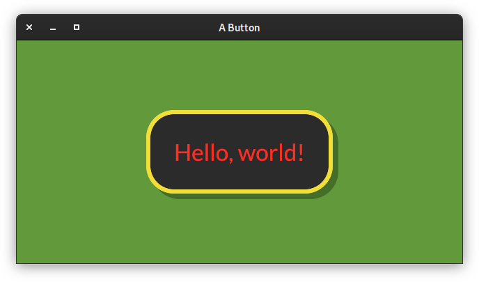
from pyiced import (
    Align, button, ButtonState, ButtonStyle, Color, container,
    ContainerStyle, IcedApp, Length, text,
)


class ButtonExample(IcedApp):
    class settings:
        class window:
            size = (640, 320)

    def __init__(self):
        self.__button_state = ButtonState()

    def title(self):
        return 'A Button'

    def view(self):
        styled_button = button(
            self.__button_state,
            text('Hello, world!', size=40),
            '',
            style=ButtonStyle(
                shadow_offset=(8, 8), border_radius=40, border_width=6,
                background=Color(0.17, 0.17, 0.17),
                border_color=Color(0.95, 0.87, 0.22),
                text_color=Color(1.00, 0.18, 0.13)
            ),
            padding=40,
        )
        return container(
            styled_button,
            style=ContainerStyle(background=Color(0.38, 0.60, 0.23)),
            padding=20, align_x=Align.CENTER, align_y=Align.CENTER,
            width=Length.FILL, height=Length.FILL,
        )


if __name__ == '__main__':
    ButtonExample().run()
See also
- pyiced.checkbox(is_checked, label, f=None, *, size=None, width=None, spacing=None, text_size=None, font=None, style=None)
A box that can be checked.
- Parameters
is_checked (bool) – Whether the checkbox is currently checked or not.
label (str) – A text besides the checkbox. Might be empty.
f (Optional[Callable[[bool], Optional[object]]]) –
Function to call when the checkbox is toggled. The argument is the new checked state.
The function can return a message that will be received in the app’s
update()loop.size (Optional[int]) – Size of the checkbox.
width (Optional[Length]) – Width of the widget (checkbox and text).
spacing (Optional[int]) – Space between checkbox and text.
text_size (Optional[int]) – Font size of the text.
font (Optional[Font]) – Font of the text.
style (Optional[CheckboxStyleSheet]) – Style of the checkbox.
- Returns
Newly created checkbox.
- Return type
Example
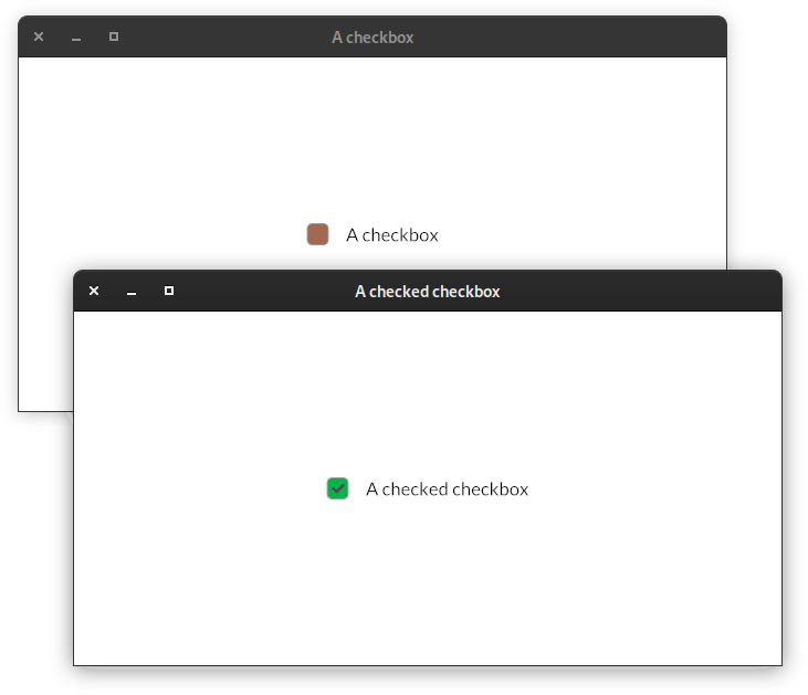
from pyiced import (
    Align, checkbox, CheckboxStyle, CheckboxStyleSheet, Color, container,
    IcedApp, Length,
)


class CheckboxExample(IcedApp):
    class settings:
        class window:
            size = (640, 320)

    def __init__(self):
        self.__is_checked = False

    def title(self):
        if self.__is_checked:
            return 'A checked checkbox'
        else:
            return 'A checkbox'

    def view(self):
        styled_checkbox = checkbox(
            self.__is_checked,
            self.title(),
            self.__set_checked,
            style=CheckboxStyleSheet(
                active=CheckboxStyle(
                    'active',
                    background=Color(0.64, 0.41, 0.32),
                ),
                active_checked=CheckboxStyle(
                    'active_checked',
                    background=Color(0, 0.71, 0.296),
                ),
            ),
        )
        return container(
            styled_checkbox,
            padding=20, align_x=Align.CENTER, align_y=Align.CENTER,
            width=Length.FILL, height=Length.FILL,
        )

    def __set_checked(self, value):
        self.__is_checked = value


if __name__ == '__main__':
    CheckboxExample().run()
- pyiced.column(children, *, spacing=None, padding=None, width=None, height=None, max_width=None, max_height=None, align_items=None)
A container that distributes its contents vertically.
- Parameters
children (Iterable[Optional[Element]]) – Create the column with the given elements.
spacing (Optional[int]) – Vertical spacing between elements.
padding (Optional[int]) – Padding of the column.
width (Optional[Length]) – Width of the column.
height (Optional[Length]) – Height of the column.
max_width (Optional[int]) – Maximum width of the column.
max_height (Optional[int]) – Maximum height of the column in pixels.
align_items (Optional[Align]) – Horizontal alignment of the contents of the column.
- Returns
The newly created column.
- Return type
Example
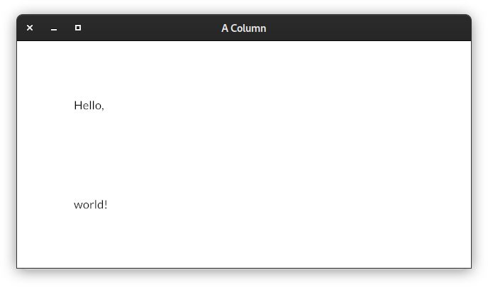
from pyiced import column, IcedApp, text


class ColumnExample(IcedApp):
    class settings:
        class window:
            size = (640, 320)

    def title(self):
        return 'A Column'

    def view(self):
        return column(
            [text('Hello,'), text('world!')],
            padding=80, spacing=120,
        )


if __name__ == '__main__':
    ColumnExample().run()
See also
- pyiced.container(content, *, padding=None, width=None, height=None, max_width=None, max_height=None, align_x=None, align_y=None, style=None)
Make a .
- Returns
The newly created .
- Return type
- pyiced.image(handle, *, width=None, height=None)
A frame that displays an image while keeping aspect ratio.
- Parameters
handle (ImageHandle) – The handle of the image.
width (Optional[Length]) – The width of the image.
heigth (Optional[Length]) – The height of the image.
- Returns
The newly created image element.
- Return type
Example
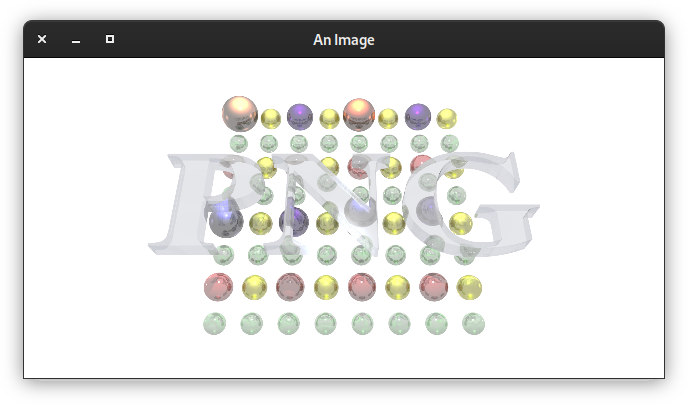
from asyncio import open_connection
from contextlib import closing

from pyiced import Align, container, IcedApp, image, ImageHandle, Length, text


class ImageExample(IcedApp):
    def __init__(self):
        self.__handle = None

    class settings:
        class window:
            size = (640, 320)

    def title(self):
        return 'An Image'

    def new(self):
        return load_image()

    def update(self, msg, clipboard):
        match msg:
            case ('ImageHandle', handle):
                self.__handle = handle

    def view(self):
        if self.__handle is None:
            return text('Loading …')

        return container(
            image(
                self.__handle,
                height=Length.units(300),
                width=Length.units(600),  # the aspect ratio is preserved
            ),
            align_x=Align.CENTER, align_y=Align.CENTER,
            width=Length.FILL, height=Length.FILL,
        )


async def load_image():
    HOST = 'upload.wikimedia.org'
    PATH = '/wikipedia/de/b/bb/Png-logo.png'

    query = (
        f"GET {PATH} HTTP/1.0\r\n"
        f"Host: {HOST}\r\n"
        f"Connection: closed\r\n"
        f"User-Agent: Mozilla/1.22 (compatible; MSIE 2.0; Windows 95)\r\n"
        f"\r\n"
    ).encode('US-ASCII')

    reader, writer = await open_connection(HOST, 443, ssl=True)
    with closing(writer):
        writer.write(query)
        await writer.drain()
        while (await reader.readline()) != b'\r\n':
            continue

        data = await reader.read()
    await writer.wait_closed()

    return ('ImageHandle', ImageHandle.from_memory(data))


if __name__ == '__main__':
    ImageExample().run()
See also
- pyiced.no_element(content, *, padding=None, width=None, height=None, max_width=None, max_height=None, align_x=None, align_y=None)
A
space()with minimum width and height.You should never actually need to use this function is code.
- Returns
The newly created empty space.
- Return type
- pyiced.pick_list(state, options, selected, on_selected, *, text_size=None, font=None, style=None)
A widget for selecting a single value from a list of options.
- Parameters
state (PickListState) – Current state of the pick list. The same object must be given between calls.
options (Iterable[Optional[str]]) – Values to select from.
selected (Optional[str]) – The currently selected value.
on_selected (Callable[[str], Optional[object]]) –
Function to call when a new value was selected.
The function can return a message that will be received in the app’s
update()loop.text_size (Optional[int]) – The text size of the pick list.
font (Optional[Font]) – Font of the pick list.
style (Optional[PickListStyle]) – Style of the pick list.
- Returns
The newly created pick list.
- Return type
Example
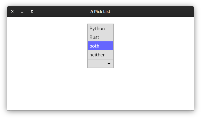
from asyncio import sleep

from pyiced import (
    Align, container, IcedApp, Length, pick_list, PickListState, text,
)


class PickListExample(IcedApp):
    class settings:
        class window:
            size = (640, 320)

    def __init__(self):
        self.__pick_list_state = PickListState()
        self.__selected = None
        self.__enabled = True

    def title(self):
        return 'A Pick List'

    def view(self):
        if self.__enabled:
            element = pick_list(
                self.__pick_list_state,
                ['Python', 'Rust', 'both', 'neither'],
                self.__selected,
                self.__select,
            )
        else:
            element = text(':-(')

        return container(
            element,
            padding=20, align_x=Align.CENTER, align_y=Align.CENTER,
            width=Length.FILL, height=Length.FILL,
        )

    def update(self, msg, clipboard):
        match msg:
            case 'enable':
                self.__enabled = True
            case 'disable':
                self.__enabled = False
                return [reenable()]

    def __select(self, value):
        if value == 'neither':
            self.__selected = None
            return 'disable'

        self.__selected = value


async def reenable():
    await sleep(2.0)
    return 'enable'


if __name__ == '__main__':
    PickListExample().run()
- pyiced.progress_bar(start, end, value, *, width=None, height=None, style=None)
A bar that displays progress.
- Parameters
start (float) – Minimum value inside the value range.
end (float) – Maximum value inside the value range.
value (float) – Current value of the progress bar.
width (Optional[Length]) – Width of the progress bar.
height (Optional[Length]) – Height of the progress bar.
style (Optional[ProgressBarStyleSheet]) – Style of the progress bar.
- Returns
The newly created progress bar.
- Return type
Example
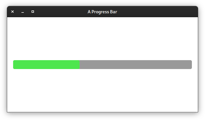
from datetime import timedelta

from pyiced import Align, container, every, IcedApp, Length, progress_bar


class ProgressBarExample(IcedApp):
    class settings:
        class window:
            size = (640, 320)

    def __init__(self):
        self.__value = 0.0

    def title(self):
        return 'A Progress Bar'

    def subscriptions(self):
        if self.__value < 1:
            return [every(timedelta(milliseconds=10), 'progress')]

    def update(self, msg, clipboard):
        match msg:
            case ('progress', _):
                self.__value = (self.__value + 0.001)

    def view(self):
        return container(
            progress_bar(0, 1, self.__value),
            padding=20, align_x=Align.CENTER, align_y=Align.CENTER,
            width=Length.FILL, height=Length.FILL,
        )


if __name__ == '__main__':
    ProgressBarExample().run()
- pyiced.radio(value, label, selected, f, *, size=None, width=None, spacing=None, text_size=None)
A circular button representing a choice.
- Parameters
value (int) – Identifier of the option.
label (str) – Label next to the radio button.
selected (Optional[int]) – The identifier of the currently selected option.
f (Callable[[int], Optional[object]]) –
Function to call with the value as argument if the radio was selected. The call may update selected for the next call, or it can be ignored, e.g. if the select is invalid.
The function can return a message that will be received in the app’s
update()loop.size (Optional[int]) – The diameter of the circle.
width (Optional[Length]) – The width including the text.
spacing (Optional[int]) – The spacing between the radio button and its text.
text_size (Optional[int]) – The size of the text.
style (Optional[RadioStyleSheet]) – Style of the radio button.
- Returns
The newly created radio button.
- Return type
See also
- pyiced.row(children, *, spacing=None, padding=None, width=None, height=None, max_width=None, max_height=None, align_items=None)
A container that distributes its contents horizontally.
- Parameters
children (Iterable[Optional[Element]]) – Create the row with the given elements.
spacing (Optional[int]) – Sets the horizontal spacing between elements.
padding (Optional[int]) – Padding of the row.
width (Optional[Length]) – Width of the row.
height (Optional[Length]) – Height of the row.
max_width (Optional[int]) – Maximum width of the row.
max_height (Optional[int]) – Maximum height of the row.
align_items (Optional[Align]) – Vertical alignment of the contents of the row.
- Returns
The newly created row.
- Return type
Example
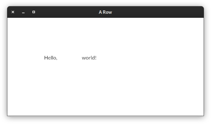
from pyiced import IcedApp, row, text


class RowExample(IcedApp):
    class settings:
        class window:
            size = (640, 320)

    def title(self):
        return 'A Row'

    def view(self):
        return row(
            [text('Hello,'), text('world!')],
            padding=120, spacing=80,
        )


if __name__ == '__main__':
    RowExample().run()
See also
- pyiced.rule(*, horizontal=0, vertical=0, style=None)
Display a horizontal or vertical rule for dividing content.
- Parameters
horizontal (Optional[int]) – Creates a horizontal rule for dividing content by the given vertical spacing.
vertical (Optional[int]) – Creates a vertical rule for dividing content by the given horizontal spacing.
style (Optional[RuleStyleSheet]) – The style of the rule.
- Returns
The newly created divider.
- Return type
See also
- pyiced.scrollable(children, *, spacing=None, padding=None, width=None, height=None, max_width=None, max_heigth=None, align_items=None, scrollbar_width=None, scrollbar_margin=None, scroller_width=None, style=None)
A widget that can vertically display an infinite amount of content with a scrollbar.
- Parameters
state (ScrollableState) – Current state of the scroll container. The same object must be given between calls.
children (Iterator[Optional[Element]]) – Elements of the scrollable
column().spacing (Optional[int]) – Vertical spacing between elements.
padding (Optional[int]) – Padding of the Scrollable.
width (Optional[Length]) – Width of the scrollable.
height (Optional[Length]) – Height of the scrollable.
max_width (Optional[int]) – Maximum width of the scrollable.
max_height (Optional[int]) – Maximum height of the scrollable in pixels.
align_items (Optional[Align]) – Horizontal alignment of the contents of the scrollable.
scrollbar_width (Optional[int]) – Scrollbar width of the Scrollable. Silently enforces a minimum value of 1.
scrollbar_margin (Optional[int]) – Scrollbar margin of the scrollable.
scroller_width (Optional[int]) – Scroller width of the scrollable. Silently enforces a minimum value of 1.
style (Optional[ScrollableStyleSheet]) – The style of the scrollable.
- Returns
The newly created scrollable widget.
- Return type
- pyiced.slider(state, start, end, value, on_change, *, on_release=None, width=None, height=None, step=1.0, style=None)
An horizontal bar and a handle that selects a single value from a range of values.
- Parameters
state (SliderState) – Current state of the slider. The same object must be given between calls.
start (float) – Smallest value inside the range.
end (float) – Biggest value inside the range.
value (float) – Current value.
on_change (Callable[[float], Optional[object]]) –
Function to call with the new value.
The function can return a message that will be received in the app’s
update()loop.on_release (Optional[object]) –
Sets the release message of the Slider. This is called when the mouse is released from the slider.
Typically, the user’s interaction with the slider is finished when this message is produced. This is useful if you need to spawn a long-running task from the slider’s result, where the default on_change message could create too many events.
width (Optional[Length]) – Width of the slider.
height (Optional[int]) – Height of the slider.
step (float) – Step size of the slider.
style (SliderStyleSheet) – The normal style of the slider.
- Returns
The newly created .
- Return type
See also
- pyiced.space(*, width=None, height=None)
An amount of empty space.
It can be useful if you want to fill some space with nothing.
- Parameters
- Returns
The newly created .
- Return type
See also
- pyiced.svg(handle, *, width=None, height=None)
A vector graphics image.
An SVG image resizes smoothly without losing any quality.
SVG images can have a considerable rendering cost when resized, specially when they are complex.
- Parameters
- Returns
The newly created SVG image.
- Return type
Example
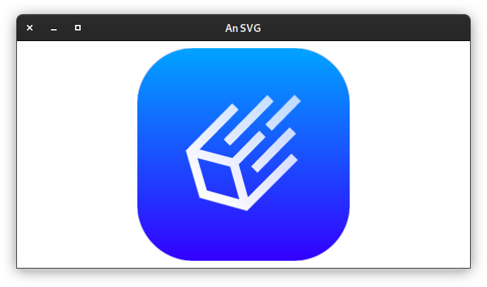
from asyncio import open_connection
from contextlib import closing

from pyiced import Align, container, IcedApp, Length, svg, SvgHandle, text


class SvgExample(IcedApp):
    def __init__(self):
        self.__handle = None

    class settings:
        class window:
            size = (640, 320)

    def title(self):
        return 'An SVG'

    def new(self):
        return load_svg()

    def update(self, msg, clipboard):
        match msg:
            case ('SvgHandle', handle):
                self.__handle = handle

    def view(self):
        if self.__handle is None:
            return text('Loading …')

        return container(
            svg(
                self.__handle,
                height=Length.units(300), width=Length.units(300),
            ),
            align_x=Align.CENTER, align_y=Align.CENTER,
            width=Length.FILL, height=Length.FILL,
        )


async def load_svg():
    HOST = 'raw.githubusercontent.com'
    PATH = '/iced-rs/iced/master/docs/logo.svg'

    query = (
        f"GET {PATH} HTTP/1.0\r\n"
        f"Host: {HOST}\r\n"
        f"Connection: closed\r\n"
        f"User-Agent: Mozilla/1.22 (compatible; MSIE 2.0; Windows 95)\r\n"
        f"\r\n"
    ).encode('US-ASCII')

    reader, writer = await open_connection(HOST, 443, ssl=True)
    with closing(writer):
        writer.write(query)
        await writer.drain()
        while (await reader.readline()) != b'\r\n':
            continue

        data = await reader.read()
    await writer.wait_closed()

    return ('SvgHandle', SvgHandle.from_memory(data))


if __name__ == '__main__':
    SvgExample().run()
See also
- pyiced.text(label, *, size=None, color=None, font=None, width=None, height=None, horizontal_alignment=None, vertical_alignment=None)
A paragraph of text.
- Parameters
label (str) – The text to display.
size (Optional[int]) – The size of the text.
color (Optional[Color]) – The color of the text.
font (Optional[Font]) – The Font of the text.
width (Optional[Length]) – The width of the text boundaries
height (Optional[Length]) – The height of the text boundaries
horizontal_alignment (Optional[HorizontalAlignment]) – The horizontal alignment of the text.
vertical_alignment (Optional[VerticalAlignment]) – The vertical alignment of the Text
- Returns
The newly created text label.
- Return type
See also
- pyiced.text_input(state, placeholder, value, on_change, *, font=None, width=None, max_width=None, padding=None, size=None, on_submit=None, password=False)
A field that can be filled with text.
- Parameters
state (TextInputState) – Current state of the input element. The same object must be given between calls.
placeholder (str) – Placeholder text for an element input.
value (str) – Current value of the input element.
on_change (Callable[[str], Optional[object]]) –
Function to call when the text was changed. The new text is the argument of the callback function. The new text should be value for argument “value”, but you may reject the new text if it does not fit some criteria defined by you.
The function can return a message that will be received in the app’s
update()loop.font (Optional[Font]) – The font of the text.
width (Optional[Length]) – The width of the input element.
max_width (Optional[int]) – The maximum width of the input element.
padding (Optional[int]) – The padding of the input element.
size (Optional[int]) – The text size of the input element.
on_submit (Optional[object]) – Message to send to
pyiced.IcedApp.update()if Enter was pressed.password (bool) – If set to True, the input element becomes a secure password input.
- Returns
The newly created text input element.
- Return type
- pyiced.tooltip(content, tooltip, position, *, font, gap, padding)
Make a tooltip.
- Parameters
content (Element) – Contained element that has a tooltip.
tooltip (str) – Tooltip text to display.
position (TooltipPosition) – The position of the tooltip.
size (Optional[int]) – The size of the text of the tooltip.
font (Optional[Font]) – The font of the tooltip.
gap (Optional[int]) – The gap between the content and its tooltip.
padding (Optional[int]) –
- Returns
The newly created tooltip.
- Return type