Displayable Elements
Overview
|
A generic widget that produces a message when pressed. |
|
A box that can be checked. |
|
A container that distributes its contents vertically. |
|
An element decorating some content. |
|
A frame that displays an image while keeping aspect ratio. |
A |
|
|
A widget for selecting a single value from a list of options. |
|
A bar that displays progress. |
|
A circular button representing a choice. |
|
A container that distributes its contents horizontally. |
|
Display a horizontal or vertical rule for dividing content. |
|
A widget that can vertically display an infinite amount of content with a scrollbar. |
|
An horizontal bar and a handle that selects a single value from a range of values. |
|
An amount of empty space. |
|
A vector graphics image. |
|
A paragraph of text. |
|
A field that can be filled with text. |
|
Make a tooltip. |
Details
- pyiced.button(state, content, on_press=None, *, width=None, height=None, min_width=None, min_height=None, padding=None, style=None)
A generic widget that produces a message when pressed.
- Parameters
state (ButtonState) – Current state of the button. The same object must be given between calls.
content (Element) – The element displayed inside the button, e.g. a
text().on_press (Optional[object]) – Message to send to the app’s
update()loop when the key was clicked. Without this argument the button won’t be clickable.width (Optional[Length]) – Width the the button.
height (Optional[Length]) – Height the the button.
min_width (Optional[int]) – Minimum width of the button in pixels.
min_height (Optional[int]) – Minimum height of the button in pixels.
padding (Optional[int]) – Amount of pixels surrounding the contained element.
style (Optional[ButtonStyleSheet]) – The style of the button.
- Returns
The newly created button.
- Return type
Example
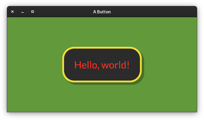
from pyiced import (
    Align, button, ButtonState, ButtonStyle, ButtonStyleSheet, Color,
    container, ContainerStyle, IcedApp, Length, Settings, text,
    WindowSettings,
)


class ButtonExample(IcedApp):
    class settings(Settings):
        class window(WindowSettings):
            size = (640, 320)

    def __init__(self):
        self.__button_state = ButtonState()

    def title(self):
        return 'A Button'

    def view(self):
        styled_button = button(
            self.__button_state,
            text('Hello, world!', size=40),
            '',
            style=ButtonStyleSheet(ButtonStyle(
                shadow_offset=(8, 8), border_radius=40, border_width=6,
                background=Color(0.17, 0.17, 0.17),
                border_color=Color(0.95, 0.87, 0.22),
                text_color=Color(1.00, 0.18, 0.13)
            )),
            padding=40,
        )
        return container(
            styled_button,
            style=ContainerStyle(background=Color(0.38, 0.60, 0.23)),
            padding=20, align_x=Align.CENTER, align_y=Align.CENTER,
            width=Length.FILL, height=Length.FILL,
        )


if __name__ == '__main__':
    ButtonExample().run()
See also
- pyiced.checkbox(token, is_checked, label, *, size=None, width=None, spacing=None, text_size=None, font=None, style=None)
A box that can be checked.
- Parameters
token (object) – When the user changes the text, a message
(token, new_is_checked)is sent to the app’supdate()method.is_checked (bool) – Whether the checkbox is currently checked or not.
label (str) – A text besides the checkbox. Might be empty.
size (Optional[int]) – Size of the checkbox.
width (Optional[Length]) – Width of the widget (checkbox and text).
spacing (Optional[int]) – Space between checkbox and text.
text_size (Optional[int]) – Font size of the text.
font (Optional[Font]) – Font of the text.
style (Optional[CheckboxStyleSheet]) – Style of the checkbox.
- Returns
Newly created checkbox.
- Return type
Example
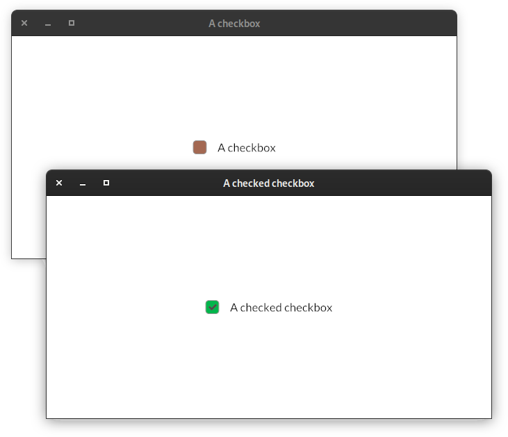
from pyiced import (
    Align, checkbox, CheckboxStyle, CheckboxStyleSheet, Color,
    container, IcedApp, Length, Settings, WindowSettings,
)


class CheckboxExample(IcedApp):
    class settings(Settings):
        class window(WindowSettings):
            size = (640, 320)

    def __init__(self):
        self.__is_checked = False

    def title(self):
        if self.__is_checked:
            return 'A checked checkbox'
        else:
            return 'A checkbox'

    def view(self):
        styled_checkbox = checkbox(
            'set',
            self.__is_checked,
            self.title(),
            style=CheckboxStyleSheet(
                active=CheckboxStyle(
                    'active',
                    background=Color(0.64, 0.41, 0.32),
                ),
                active_checked=CheckboxStyle(
                    'active_checked',
                    background=Color(0, 0.71, 0.296),
                ),
            ),
        )
        return container(
            styled_checkbox,
            padding=20, align_x=Align.CENTER, align_y=Align.CENTER,
            width=Length.FILL, height=Length.FILL,
        )

    def update(self, msg, clipboard):
        match msg:
            case 'set', is_checked:
                self.__is_checked = is_checked


if __name__ == '__main__':
    CheckboxExample().run()
- pyiced.column(children, *, spacing=None, padding=None, width=None, height=None, max_width=None, max_height=None, align_items=None)
A container that distributes its contents vertically.
- Parameters
children (Iterable[Optional[Element]]) – Create the column with the given elements.
spacing (Optional[int]) – Vertical spacing between elements.
padding (Optional[int]) – Padding of the column.
width (Optional[Length]) – Width of the column.
height (Optional[Length]) – Height of the column.
max_width (Optional[int]) – Maximum width of the column.
max_height (Optional[int]) – Maximum height of the column in pixels.
align_items (Optional[Align]) – Horizontal alignment of the contents of the column.
- Returns
The newly created column.
- Return type
Example
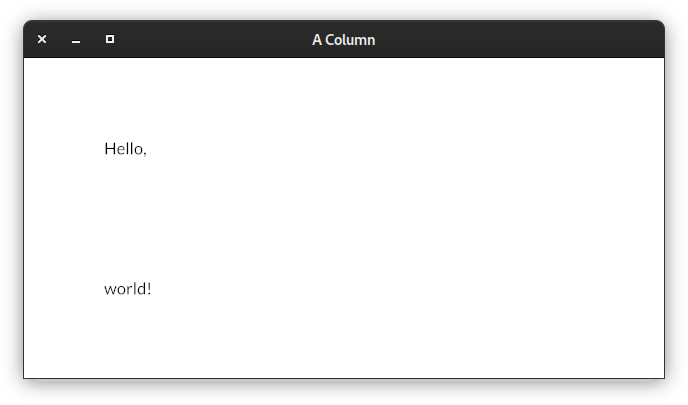
from pyiced import column, IcedApp, Settings, text, WindowSettings


class ColumnExample(IcedApp):
    class settings(Settings):
        class window(WindowSettings):
            size = (640, 320)

    def title(self):
        return 'A Column'

    def view(self):
        return column(
            [text('Hello,'), text('world!')],
            padding=80, spacing=120,
        )


if __name__ == '__main__':
    ColumnExample().run()
See also
- pyiced.container(content, *, padding=None, width=None, height=None, max_width=None, max_height=None, align_x=None, align_y=None, style=None)
An element decorating some content.
It is normally used for alignment purposes.
- Parameters
content (Element) – The content of the container.
padding (Optional[int]) – The padding around the content.
width (Optional[Length]) – The width of the container.
height (Optional[Length]) – The height of the container.
max_width (Optional[int]) – The maximum width of the container
max_height (Optional[int]) – The maximum height of the container.
align_x (Optional[Length]) – The horizontal alignment of the content inside the container.
align_y (Optional[Length]) – The vertical alignment of the content inside the container.
style (Optional[ContainerStyleSheet]) – The style of the container.
- Returns
The newly created .
- Return type
- pyiced.image(handle, *, width=None, height=None)
A frame that displays an image while keeping aspect ratio.
- Parameters
handle (ImageHandle) – The handle of the image.
width (Optional[Length]) – The width of the image.
heigth (Optional[Length]) – The height of the image.
- Returns
The newly created image element.
- Return type
Example
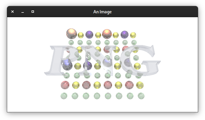
from asyncio import open_connection
from contextlib import closing

from pyiced import (
    Align, container, IcedApp, image, ImageHandle, Length, Settings,
    text, WindowSettings,
)


class ImageExample(IcedApp):
    def __init__(self):
        self.__handle = None

    class settings(Settings):
        class window(WindowSettings):
            size = (640, 320)

    def title(self):
        return 'An Image'

    def new(self):
        return [load_image()]

    def update(self, msg, clipboard):
        match msg:
            case ('ImageHandle', handle):
                self.__handle = handle

    def view(self):
        if self.__handle is None:
            return text('Loading …')

        return container(
            image(
                self.__handle,
                height=Length.units(300),
                width=Length.units(600),  # the aspect ratio is preserved
            ),
            align_x=Align.CENTER, align_y=Align.CENTER,
            width=Length.FILL, height=Length.FILL,
        )


async def load_image():
    HOST = 'upload.wikimedia.org'
    PATH = '/wikipedia/de/b/bb/Png-logo.png'

    query = (
        f"GET {PATH} HTTP/1.0\r\n"
        f"Host: {HOST}\r\n"
        f"Connection: closed\r\n"
        f"User-Agent: Mozilla/1.22 (compatible; MSIE 2.0; Windows 95)\r\n"
        f"\r\n"
    ).encode('US-ASCII')

    reader, writer = await open_connection(HOST, 443, ssl=True)
    with closing(writer):
        writer.write(query)
        await writer.drain()
        while (await reader.readline()) != b'\r\n':
            continue

        data = await reader.read()
    await writer.wait_closed()

    return ('ImageHandle', ImageHandle.from_memory(data))


if __name__ == '__main__':
    ImageExample().run()
See also
- pyiced.no_element()
A
space()with minimum width and height.- Returns
The newly created empty space.
- Return type
- pyiced.pick_list(token, state, selected, options, *, text_size=None, font=None, style=None)
A widget for selecting a single value from a list of options.
- Parameters
token (object) – When the user select a value, a message
(token, new_value)is sent to the app’supdate()method.state (PickListState) – Current state of the pick list. The same object must be given between calls.
selected (Optional[str]) – The currently selected value.
options (Iterable[Optional[str]]) – Values to select from.
text_size (Optional[int]) – The text size of the pick list.
font (Optional[Font]) – Font of the pick list.
style (Optional[PickListStyle]) – Style of the pick list.
- Returns
The newly created pick list.
- Return type
Example
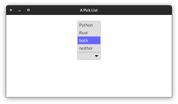
from asyncio import sleep

from pyiced import (
    Align, container, IcedApp, Length, pick_list, PickListState,
    Settings, text, WindowSettings,
)


class PickListExample(IcedApp):
    class settings(Settings):
        class window(WindowSettings):
            size = (640, 320)

    def __init__(self):
        self.__pick_list_state = PickListState()
        self.__selected = None
        self.__enabled = True

    def title(self):
        return 'A Pick List'

    def view(self):
        if self.__enabled:
            element = pick_list(
                'select',
                self.__pick_list_state,
                self.__selected,
                ['Python', 'Rust', 'both', 'neither'],
            )
        else:
            element = text(':-(')

        return container(
            element,
            padding=20, align_x=Align.CENTER, align_y=Align.CENTER,
            width=Length.FILL, height=Length.FILL,
        )

    def update(self, msg, clipboard):
        match msg:
            case 'select', 'neither':
                self.__enabled = False
                return [reenable()]
            case 'select', value:
                self.__selected = value
            case 'enable':
                self.__enabled = True


async def reenable():
    await sleep(2.0)
    return 'enable'


if __name__ == '__main__':
    PickListExample().run()
- pyiced.progress_bar(start, end, value, *, width=None, height=None, style=None)
A bar that displays progress.
- Parameters
start (float) – Minimum value inside the value range.
end (float) – Maximum value inside the value range.
value (float) – Current value of the progress bar.
width (Optional[Length]) – Width of the progress bar.
height (Optional[Length]) – Height of the progress bar.
style (Optional[ProgressBarStyleSheet]) – Style of the progress bar.
- Returns
The newly created progress bar.
- Return type
Example
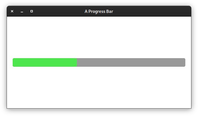
from datetime import timedelta

from pyiced import (
    Align, container, every, IcedApp, Length, progress_bar, Settings,
    WindowSettings,
)


class ProgressBarExample(IcedApp):
    class settings(Settings):
        class window(WindowSettings):
            size = (640, 320)

    def __init__(self):
        self.__value = 0.0

    def title(self):
        return 'A Progress Bar'

    def subscriptions(self):
        if self.__value < 1:
            return [every(timedelta(milliseconds=10), 'progress')]

    def update(self, msg, clipboard):
        match msg:
            case ('progress', _):
                self.__value = (self.__value + 0.001)

    def view(self):
        return container(
            progress_bar(0, 1, self.__value),
            padding=20, align_x=Align.CENTER, align_y=Align.CENTER,
            width=Length.FILL, height=Length.FILL,
        )


if __name__ == '__main__':
    ProgressBarExample().run()
- pyiced.radio(token, selected, value, label, *, size=None, width=None, spacing=None, text_size=None, style=None)
A circular button representing a choice.
- Parameters
token (object) – When the user select this choice, a message
(token, value)is sent to the app’supdate()method.selected (Optional[int]) – The identifier of the currently selected option.
value (int) – Identifier of the option.
label (str) – Label next to the radio button.
size (Optional[int]) – The diameter of the circle.
width (Optional[Length]) – The width including the text.
spacing (Optional[int]) – The spacing between the radio button and its text.
text_size (Optional[int]) – The size of the text.
style (Optional[RadioStyleSheet]) – Style of the radio button.
- Returns
The newly created radio button.
- Return type
Example
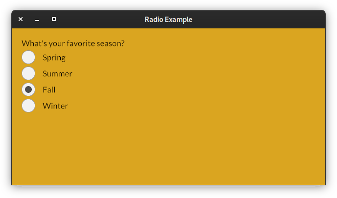
from pyiced import (
    column, css_color, IcedApp, Length, radio, Settings, text,
    WindowSettings,
)


class RadioExample(IcedApp):
    class settings(Settings):
        class window(WindowSettings):
            size = (640, 320)

    def __init__(self):
        self.__season = None

    def title(self):
        return 'Radio Example'

    def background_color(self):
        match self.__season:
            case 1:
                return css_color.MEDIUMSPRINGGREEN
            case 2:
                return css_color.LIGHTGOLDENRODYELLOW
            case 3:
                return css_color.GOLDENROD
            case 4:
                return css_color.GHOSTWHITE

    def update(self, msg, clipboard):
        match msg:
            case 'select', value:
                self.__season = value

    def view(self):
        return column(
            [
                text("What's your favorite season?"),
                radio('select', self.__season, 1, 'Spring'),
                radio('select', self.__season, 2, 'Summer'),
                radio('select', self.__season, 3, 'Fall'),
                radio('select', self.__season, 4, 'Winter'),
            ],
            padding=20, spacing=5,
            width=Length.FILL, height=Length.FILL,
        )


if __name__ == '__main__':
    RadioExample().run()
See also
- pyiced.row(children, *, spacing=None, padding=None, width=None, height=None, max_width=None, max_height=None, align_items=None)
A container that distributes its contents horizontally.
- Parameters
children (Iterable[Optional[Element]]) – Create the row with the given elements.
spacing (Optional[int]) – Sets the horizontal spacing between elements.
padding (Optional[int]) – Padding of the row.
width (Optional[Length]) – Width of the row.
height (Optional[Length]) – Height of the row.
max_width (Optional[int]) – Maximum width of the row.
max_height (Optional[int]) – Maximum height of the row.
align_items (Optional[Align]) – Vertical alignment of the contents of the row.
- Returns
The newly created row.
- Return type
Example
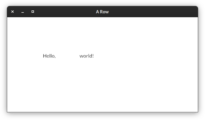
from pyiced import IcedApp, row, Settings, text, WindowSettings


class RowExample(IcedApp):
    class settings(Settings):
        class window(WindowSettings):
            size = (640, 320)

    def title(self):
        return 'A Row'

    def view(self):
        return row(
            [text('Hello,'), text('world!')],
            padding=120, spacing=80,
        )


if __name__ == '__main__':
    RowExample().run()
See also
- pyiced.rule(*, horizontal=None, vertical=None, style=None)
Display a horizontal or vertical rule for dividing content.
- Parameters
horizontal (Optional[int]) – Creates a horizontal rule for dividing content by the given vertical spacing.
vertical (Optional[int]) – Creates a vertical rule for dividing content by the given horizontal spacing.
style (Optional[RuleStyleSheet]) – The style of the rule.
- Returns
The newly created divider.
- Return type
Example
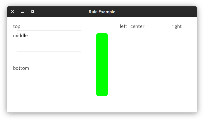
from pyiced import (
    Color, column, every, FillMode, IcedApp, Length, row, rule,
    RuleStyleSheet, Settings, text, WindowSettings,
)


class RuleExample(IcedApp):
    class settings(Settings):
        class window(WindowSettings):
            size = (640, 320)

    def new(self):
        self.__percent = 0

    def title(self):
        return 'Rule Example'

    def subscriptions(self):
        return [every(0.010, 'tick')]

    def view(self):
        vertical = column(
            [
                text('top'),
                rule(horizontal=1),
                text('middle'),
                rule(horizontal=80),
                text('bottom'),
            ],
            padding=20, spacing=5,
            width=Length.FILL, height=Length.FILL,
        )
        separator = rule(
            vertical=80,
            style=RuleStyleSheet(
                color=Color(0, 1, 0),
                width=40,
                radius=10,
                fill_mode=FillMode.percent(self.__percent),
            ),
        )
        horizontal = row(
            [
                text('left'),
                rule(vertical=1),
                text('center'),
                rule(vertical=80),
                text('right'),
            ],
            padding=20, spacing=5,
            width=Length.FILL, height=Length.FILL,
        )
        return row([vertical, separator, horizontal])

    def update(self, msg, clipboard):
        match msg:
            case ('tick', _):
                self.__percent = (self.__percent + 1) % 100


if __name__ == '__main__':
    RuleExample().run()
See also
- pyiced.scrollable(state, children, *, spacing=None, padding=None, width=None, height=None, max_width=None, max_heigth=None, align_items=None, scrollbar_width=None, scrollbar_margin=None, scroller_width=None, style=None)
A widget that can vertically display an infinite amount of content with a scrollbar.
- Parameters
state (ScrollableState) – Current state of the scroll container. The same object must be given between calls.
children (Iterable[Optional[Element]]) – Elements of the scrollable
column().spacing (Optional[int]) – Vertical spacing between elements.
padding (Optional[int]) – Padding of the Scrollable.
width (Optional[Length]) – Width of the scrollable.
height (Optional[Length]) – Height of the scrollable.
max_width (Optional[int]) – Maximum width of the scrollable.
max_height (Optional[int]) – Maximum height of the scrollable in pixels.
align_items (Optional[Align]) – Horizontal alignment of the contents of the scrollable.
scrollbar_width (Optional[int]) – Scrollbar width of the Scrollable. Silently enforces a minimum value of 1.
scrollbar_margin (Optional[int]) – Scrollbar margin of the scrollable.
scroller_width (Optional[int]) – Scroller width of the scrollable. Silently enforces a minimum value of 1.
style (Optional[ScrollableStyleSheet]) – The style of the scrollable.
- Returns
The newly created scrollable widget.
- Return type
Example
TODO
- pyiced.slider(token, state, start, end, value, step=1.0, *, width=None, height=None, style=None)
An horizontal bar and a handle that selects a single value from a range of values.
- Parameters
token (object) –
When the user select a value, a message
(token, new_value)is sent to the app’supdate()method.When the user releases the pressed slider
(token, None, 'release')is sent.state (SliderState) – Current state of the slider. The same object must be given between calls.
start (float) – Smallest value inside the range.
end (float) – Biggest value inside the range.
value (float) – Current value.
step (float) – Step size of the slider.
width (Optional[Length]) – Width of the slider.
height (Optional[int]) – Height of the slider.
style (SliderStyleSheet) – The normal style of the slider.
- Returns
The newly created slider.
- Return type
Example
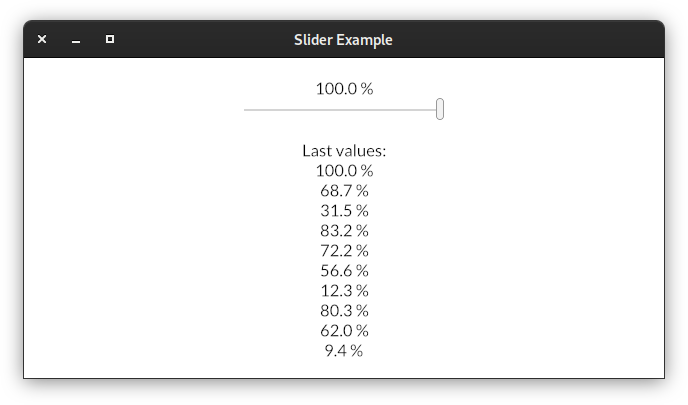
from pyiced import (
    Align, column, container, IcedApp, Length, Settings, SliderState,
    slider, text, WindowSettings,
)


class SliderApp(IcedApp):
    class settings(Settings):
        class window(WindowSettings):
            size = (640, 320)

    def __init__(self):
        self.__state = SliderState()
        self.__value = 0.5
        self.__messages = [' '] * 10

    def title(self):
        return 'Slider Example'

    def view(self):
        return container(
            column(
                [
                    text(f'{self.__value * 100:.1f} %'),
                    slider(
                        'slider', self.__state, 0, 1, self.__value, 0.0001,
                        width=Length.units(200),
                    ),
                    text(' '),
                    text('Last values:'),
                    *map(text, self.__messages),
                ],
                align_items=Align.CENTER,
            ),
            padding=20, align_x=Align.CENTER, align_y=Align.CENTER,
            width=Length.FILL, height=Length.FILL,
        )

    def update(self, msg, clipboard):
        match msg:
            case 'slider', value:
                self.__value = value
            case 'slider', None, 'release':
                self.__messages.pop()
                self.__messages[:0] = (f'{self.__value * 100:.1f} %',)


if __name__ == '__main__':
    SliderApp().run()
See also
- pyiced.space(*, width=None, height=None)
An amount of empty space.
It can be useful if you want to fill some space with nothing.
- Parameters
- Returns
The newly created empty space.
- Return type
See also
- pyiced.svg(handle, *, width=None, height=None)
A vector graphics image.
An SVG image resizes smoothly without losing any quality.
SVG images can have a considerable rendering cost when resized, specially when they are complex.
- Parameters
- Returns
The newly created SVG image.
- Return type
Example
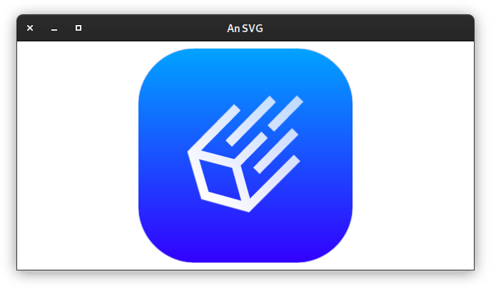
from asyncio import open_connection
from contextlib import closing

from pyiced import (
    Align, container, IcedApp, Length, Settings, svg, SvgHandle, text,
    WindowSettings,
)


class SvgExample(IcedApp):
    def __init__(self):
        self.__handle = None

    class settings(Settings):
        class window(WindowSettings):
            size = (640, 320)

    def title(self):
        return 'An SVG'

    def new(self):
        return [load_svg()]

    def update(self, msg, clipboard):
        match msg:
            case ('SvgHandle', handle):
                self.__handle = handle

    def view(self):
        if self.__handle is None:
            return text('Loading …')

        return container(
            svg(
                self.__handle,
                height=Length.units(300), width=Length.units(300),
            ),
            align_x=Align.CENTER, align_y=Align.CENTER,
            width=Length.FILL, height=Length.FILL,
        )


async def load_svg():
    HOST = 'raw.githubusercontent.com'
    PATH = '/iced-rs/iced/master/docs/logo.svg'

    query = (
        f"GET {PATH} HTTP/1.0\r\n"
        f"Host: {HOST}\r\n"
        f"Connection: closed\r\n"
        f"User-Agent: Mozilla/1.22 (compatible; MSIE 2.0; Windows 95)\r\n"
        f"\r\n"
    ).encode('US-ASCII')

    reader, writer = await open_connection(HOST, 443, ssl=True)
    with closing(writer):
        writer.write(query)
        await writer.drain()
        while (await reader.readline()) != b'\r\n':
            continue

        data = await reader.read()
    await writer.wait_closed()

    return ('SvgHandle', SvgHandle.from_memory(data))


if __name__ == '__main__':
    SvgExample().run()
See also
- pyiced.text(label, *, size=None, color=None, font=None, width=None, height=None, horizontal_alignment=None, vertical_alignment=None)
A paragraph of text.
- Parameters
label (str) – The text to display.
size (Optional[int]) – The size of the text.
color (Optional[Color]) – The color of the text.
font (Optional[Font]) – The Font of the text.
width (Optional[Length]) – The width of the text boundaries
height (Optional[Length]) – The height of the text boundaries
horizontal_alignment (Optional[HorizontalAlignment]) – The horizontal alignment of the text.
vertical_alignment (Optional[VerticalAlignment]) – The vertical alignment of the Text
- Returns
The newly created text label.
- Return type
See also
- pyiced.text_input(token, state, placeholder, value, *, font=None, width=None, max_width=None, padding=None, size=None, password=False, style=None)
A field that can be filled with text.
- Parameters
token (object) –
When the user changes the text, a message
(token, new_value)is sent to the app’supdate()method.When the user hits enter, a message
(token, None, 'submit')is sent.state (TextInputState) – Current state of the input element. The same object must be given between calls.
placeholder (str) – Placeholder text for an element input.
value (str) – Current value of the input element.
font (Optional[Font]) – The font of the text.
width (Optional[Length]) – The width of the input element.
max_width (Optional[int]) – The maximum width of the input element.
padding (Optional[int]) – The padding of the input element.
size (Optional[int]) – The text size of the input element.
password (bool) – If set to True, the input element becomes a secure password input.
style (Optional[TextInputStyleSheet]) – Style of the text input.
- Returns
The newly created text input element.
- Return type
- pyiced.tooltip(content, tooltip, position, *, font=None, size=None, gap=None, padding=None, style=None)
Make a tooltip.
- Parameters
content (Element) – Contained element that has a tooltip.
tooltip (str) – Tooltip text to display.
position (TooltipPosition) – The position of the tooltip.
font (Optional[Font]) – The font of the tooltip.
size (Optional[int]) – The size of the text of the tooltip.
gap (Optional[int]) – The gap between the content and its tooltip.
padding (Optional[int]) – TODO
style (Optional[ContainerStyleSheet]) – The style of the tooltip.
- Returns
The newly created tooltip.
- Return type